Teal Was the Mood. Mauve Is the Moment.
A Color Analyst’s Perspective
by Kasey Dugan
It’s no surprise that in a consumerist culture currently obsessed with “whimsymaxxing,” teal has seen a sudden surge in popularity. It’s been everywhere this year, from phone cases and Brandy Melville’s shelves to statement accessories like sailor hats, headbands, and purses.
I don’t know about you, but I’ve played these games before. In 2013, we yearned for mint green: a higher-value, less-saturated version of teal that felt softer and sweeter than today’s bolder shade. It carried a touch of storybook romance, worn by girly-girls in skater skirts and chunky statement necklaces from Charlotte Russe.
It tipped its hat to 1950s nostalgia, when teal was a staple of mid-century modern homes. Kitchens featured teal cabinets, aquamarine refrigerators, and cyan-blue toasters. The color also appeared in sleek, elegant cars like the 1955 Ford Thunderbird and in the polished, pastel-tinged palette of Audrey Hepburn’s iconic Breakfast at Tiffany’s.
Teal became such a celebrated color in the 1950s because of its cheerful appearance. Coming out of World War II, it’s easy to see how upbeat colors could inspire a sense of postwar optimism. Add in the boom in appliance manufacturing, and you had the perfect storm. Teal was suddenly positioned as a glamorous, inspiring, and hopeful color.
Teal is undeniably unique: it’s bright, eye-catching, and jovial. But it can also be surprisingly difficult to find in stores, especially as the shade drifts in and out of fashion. It makes the hunt-for-teal all the more alluring for teal lovers everywhere.
Its uniqueness also lies in its structure. On a standard color wheel, teal sits between pure blue and pure green. As a complementary color to red and orange, it’s typically considered cool-toned, though its temperature can shift depending on its yellow-green pigmentation. This balance between hue, saturation, and brightness is exactly what makes today’s teal interesting and distinct from its predecessors.
The teal celebrated in today’s pop culture is far more vibrant and saturated than the Mint Green of 2013 or the “Tropical Turquoise” of the 1950s. From a color-analysis perspective, this shift is especially fascinating: today’s teal draws from two relatively rare seasons, Bright Spring and Bright Winter.
If you’re unfamiliar with these palettes, they are comprised of highly saturated, high-value colors — which can be difficult to pull off. In the Western system, Bright palettes are associated with very high contrast, while the Korean system emphasizes intense chroma. For many people, bright teals can feel overpowering, reflective, or harsh against their natural features.
But maybe that harshness is exactly what draws people to it. After all, we’ve cycled through dozens of color trends in just the last few years. If butter yellow, cherry red, and coquette pink can each have their moment, why not raise a glass to obnoxious teal?
We’re in a strange moment where everyone wants to be seen as niche, cool, chic, fun . . . the list of empowering vocabulary words goes on. Teal is fun, cheeky, and attention-grabbing. If anything, we should have seen its reign coming from a mile away.
But as the temperature begins to drop, teal is losing its luster. It seems that we want something a little less loud for autumn, something moodier and more mysterious. Something mauve!
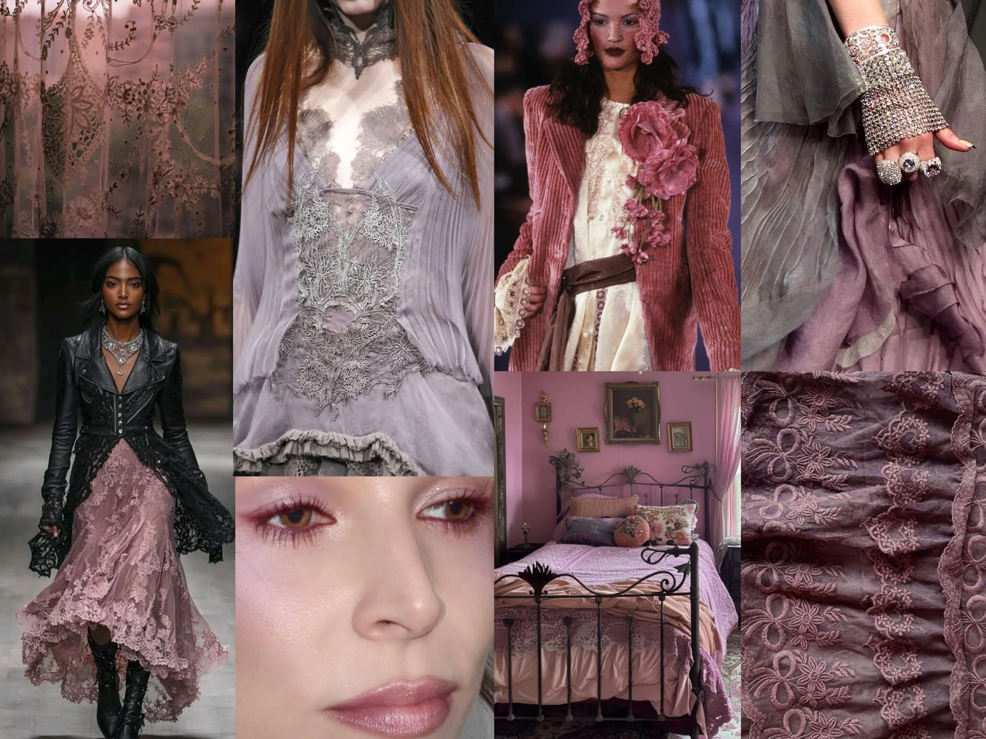
Mauve is one of those colors that’s surprisingly difficult to define, largely because everyone seems to have a different idea of what it looks like. Some picture a muted taupe-pink; others think of the berry-pink nail color their grandmother gets at the salon. I hate to say it, but neither is quite the mauve making headway this autumn.
The “mauve” we’re after is a desaturated, cool-toned hue. It bears many names: lavender gray, dusty lilac, dove purple. Compared to teal, mauve is quiet, serene, and subtle. It sparks whisperings of nostalgia, delicate romance, and maturity.
Personally, I adore mauve for it’s touch of gentle femininity in gothic and Victorian styles. Mauve-colored lace, earrings, and florals are perfectly paired with black corsets, dramatic tailcoats, and ruffled sleeves. To me, mauve is the color of painted lips on an antique porcelain doll. It’s the fabric of a baroque dress worn by a mistress running through the vampire’s castle. It’s the color of a widow’s parasol as she strolls through a graveyard.
It’s an understated hue, completely different from teal’s splashy omnipresence. I expect to see mauve show up everywhere this fall and winter, but particularly in dresses, military-style jackets, slouchy purses and satin lipsticks.
For a little bit of color science, mauve is technically considered a “pale purple” that sits comfortably between red and violet. This is important, as mauve is almost always dusty and soft, never bright or vivid. So if you see a deep plum jacket being sold as “mauve” this autumn, just know that you’re being duped! Likewise, you may see complicated variations of its name: dim mauve, pearl mauve, rose mauve, plum mauve …
While I expect mauve to be quite popular for women into alternative styles and refined elegance — I do not think it will be as replicated as teal. It’s harder to “whimsymaxx” on mauve since it is so understated and subtle. The only future I see in which mauve might become the new “it-girl” obsession is if this “whimsymaxxing” trend ends really, really soon. (I wish it would, if I’m honest. As both a term and a concept, “whimsymaxxing” might just be the most anti-whimsy thing to exist. But that’s another tangent!)
In other words, teal will soon be taking a backseat to make way for mauve. But what comes after mauve? Our relationship with color is always changing; what feels dated today can feel fresh again tomorrow. So whether it’s coral, chartreuse, or neon green next, no color is ever truly out. It’s simply waiting for its turn to come back around.
